- October 12, 2022
- Elizabeth Ryan
While there are many steps in the interior design process, if we step back and analyze why we make some choices—it is quite formulaic.
Behind each choice, we’re always thinking of the style and design personalities of each client, but give an analytical creative space and she will get all mathematical about her art.
So what’s the formula? It has three primary elements:

A Formula for Color
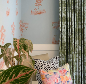
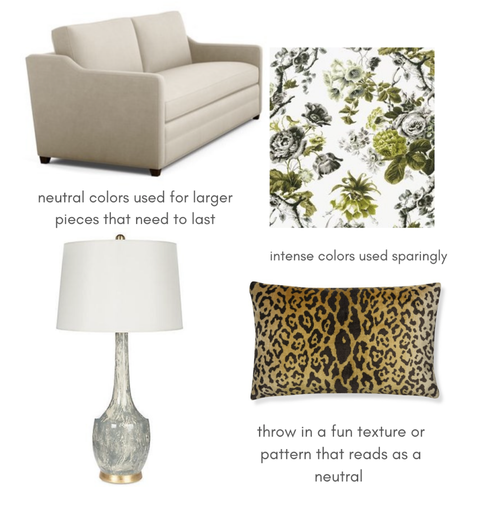
We have our favorite color, one we love. But we all study enough design to know that one does not just throw five turquoise pillows into a neutral living room and call it colorful. We don’t pick one color as our accent—we plan a party.
The party starts with the guest of honor, let’s say chartreuse. I pick this because it can be hard when you love something zingy—but we shouldn’t be scared of making our favorite thing work.
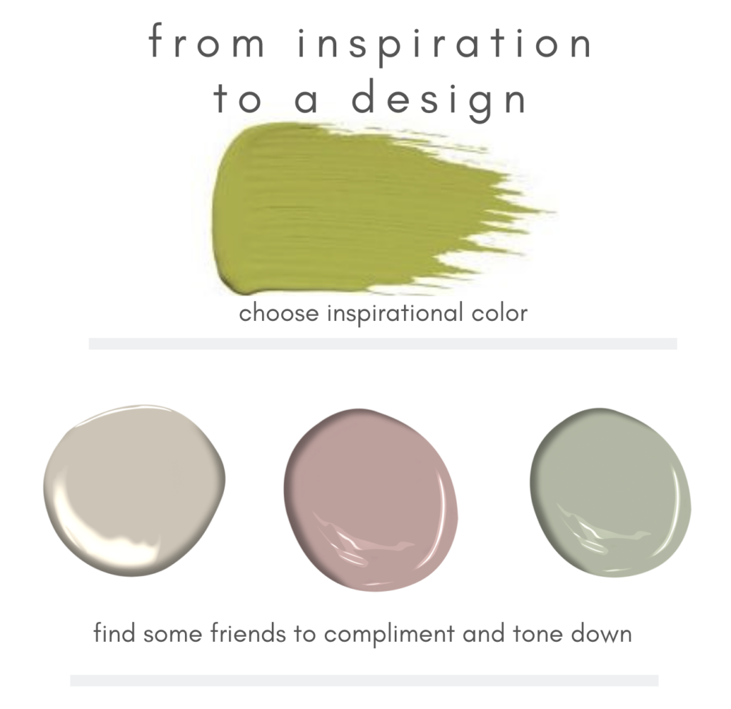
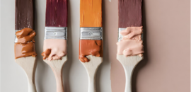
I often use paint swatches to get this color pairing juices flowing, but then start to translate these into actual items as we make selections. Art, wallpaper, and soft goods are where the majority of our colors hang out. And, of course, when someone lets me paint a room top to bottom—trim and all—in a beautiful hue. Notice how the intense color is present but not dominating.
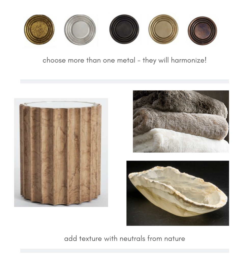
A Formula for Layers
Not everything in the space can partake in the color part of the party, but we can be thoughtful when choosing the more neutrally-toned items. Metals and natural materials are so lovely for adding a soft, textural layer.
Why just do a wood side table when you can choose an olive or burl wood veneer? An onyx or alabaster bowl hums hello in a way a simple white ceramic just can’t. And when the weather gets cold, it’s always a good idea to throw on a faux fur throw.
A Formula for Juxtaposition
Okay, I get that “juxtaposition” is a big word—and somewhat abstract thought—but stay with me. Just like there is a beautiful contrast between certain colors, I really love the interest generated when placing disparate items together. They bring out the best in each other—the special qualities in each seem to shine.
Antiques with modern lamps, a goopy oil painting over a crisp console table…fantastic possibilities.
Ready to discover your formula for design? Let’s talk.