- October 12, 2022
- Elizabeth Ryan
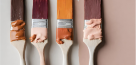
There is a lot of information out there regarding color in interior design.
Psychology suggests we choose shades for deep reasons, but it feels like the biggest influencer is truly what everyone else is selecting. Have you noticed how many more white cars are driving around? Some say it’s about a fresh outlook after two stressful years—but when it was time for me to purchase a new car one Mini Ryan advised me to choose it because “everyone else has it.”
Of course, color is everywhere so let’s think specifically about interior design. And let’s think about choosing an interesting color palette using all of this research available.
How do we best take in all the color research and apply it to make our homes feel like us—the perfect place to reflect one’s personality?
By absorbing what current color trends are, evaluating our color preferences, and seeking out interesting combinations of color, we elevate and personalize the color palette.
“Color preferences are deeply rooted emotional responses that seem to lack any rational basis, yet the powerful influence of color rules our choices in everything from the food we eat and the clothes we wear to the cars we buy.”
Douglas Fields, Psychology Today
Trends: Who Tells Us What is What?
Twenty years ago one could say fashion led the way with what colors we would start to see as current. And it makes sense, fashion is a response to what is going on in the environment and needs to reinvent itself faster than any other industry.
In 2000 Pantone, a leader in color definition, began releasing a Color of the Year. For the past two decades, as we have turned to fresh online images more and more for inspiration. Color influences come from so many places and trends shift much more quickly.
What a perfect time to lean into the colors that speak to us and the vibe we want to set in our homes.
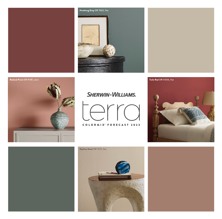
Sherwin Williams, along with many other players in the world of Interiors color, comes up with beautiful combinations of forecasted color trends. Although each color is in its standard wheelhouse, the power in the forecast is in the combinations.
We see these colors in a whole new light when paired with specific other colors.
Color Combinations
The most obvious color theory is pretty clear to most of us—chill colors make us feel chill, and invigorating colors catch our eye and make us pay attention. Great color palettes identify how to balance this spectrum perfectly and more importantly, personally.
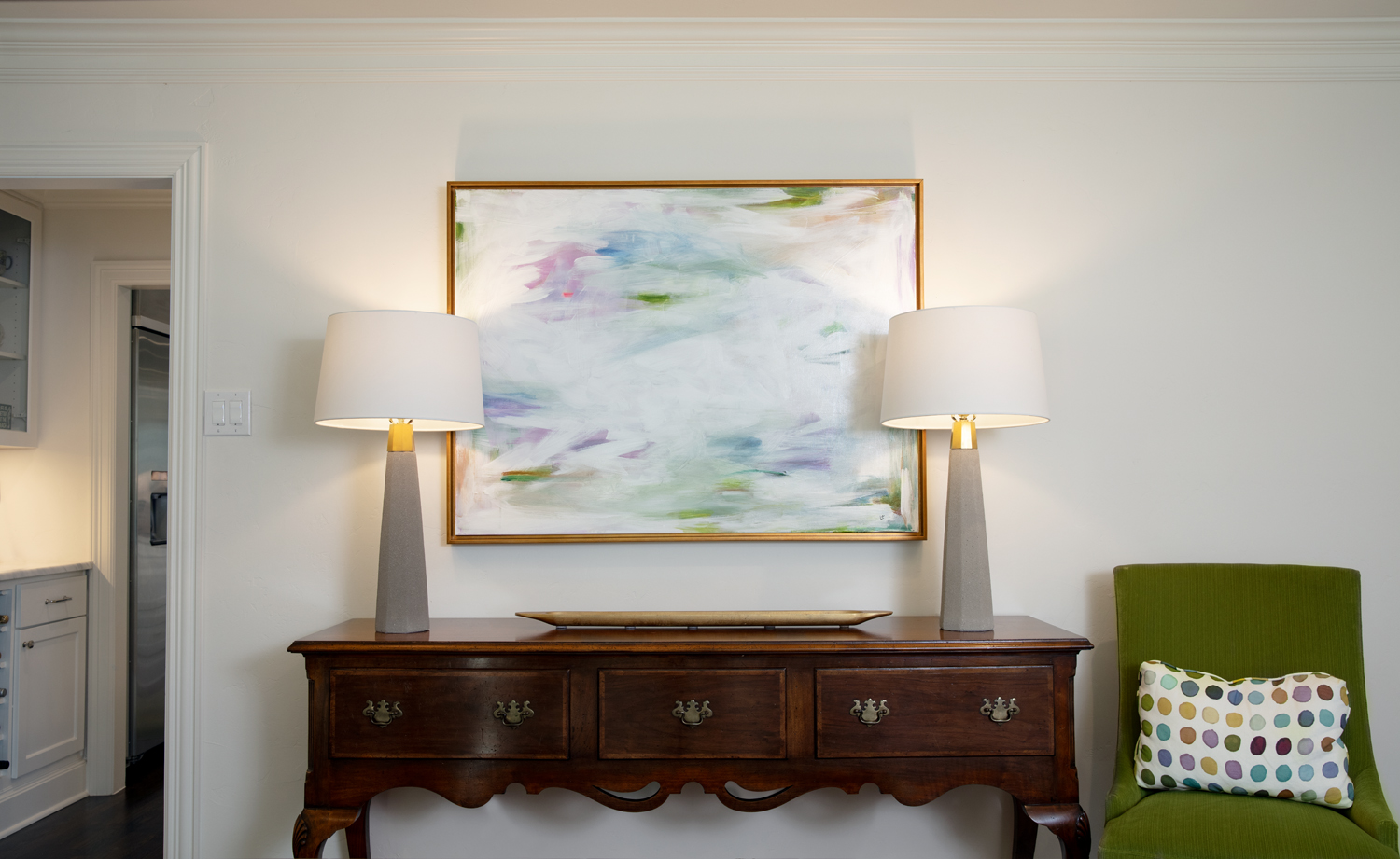
A living room of soft taupes and soothing neutrals creates a cozy, warm vibe. Warm and cozy is great for a living space, but the space is most comforting to its owner when we layer on the colors they gravitate toward, paying special attention to opportunities to add a little zing here and there to keep things interesting.
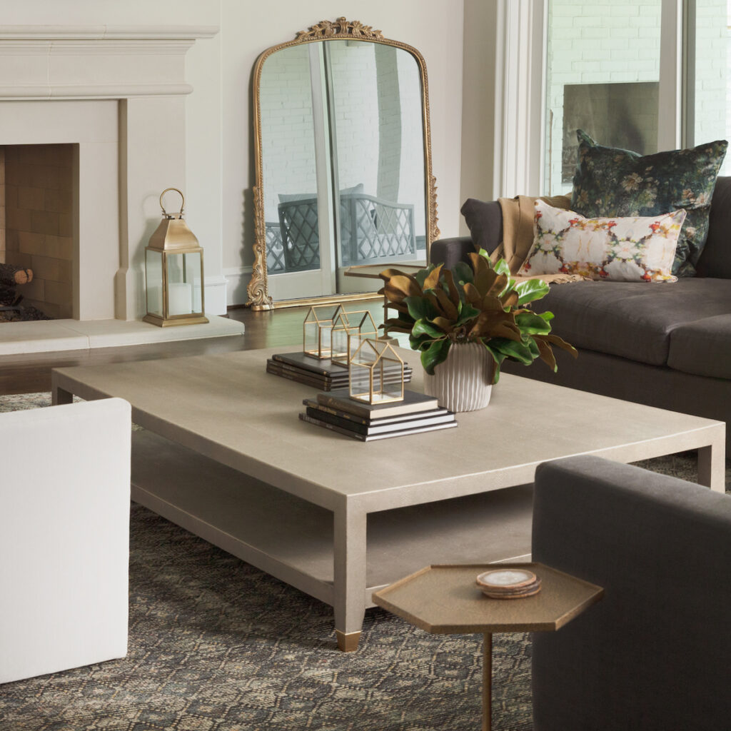
This living room from our Serene Balance project is full of classic neutrals which lend to a relaxed and balanced feel. Small additions of rich blues and greens layer don’t compete with the feeling—instead, they elevate this color palette.
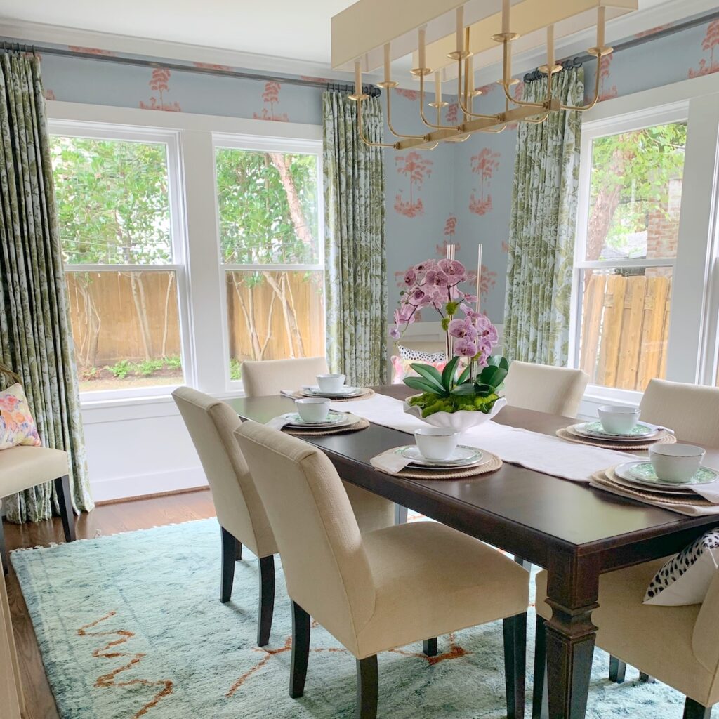
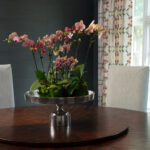
This dining room from our Citrus & Roses project includes colors we typically associate with calmness and soothing. But the interjection of a citrusy orange livens up the combination, interjecting energy.
Interactions of colors are fascinating and a larger reason why we think through color palettes so carefully. At times we are working to enhance or subdue certain elements in a space.
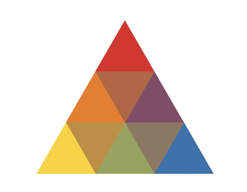
The above image is from Interaction of Color by Josef Albers. The arrangement of colors is so helpful to examine the relationships, just to get why some things feel amazing or not so amazing—depending on the goal.
A favorite green (middle triangle) can really shine when combined with a warm gray and a blue (right side) but gets lost when paired with a dominant yellow or ochre (left side).
Fascinated or intimidated?
Either way, this color fanatic is here to help kick-start your project in a colorful way. Ready to get started? Contact us.


Nicole Heymer
| 18 October 2022You are the queen of color theory!
Elizabeth Ryan
| 30 October 2022Thank you!