- May 16, 2026
- Elizabeth Ryan
There’s a version of calm that most people default to when choosing interior paint colors for their home. Pull back the color, simplify the layers, keep everything quiet. It’s a reasonable instinct. But it’s not the only way to get there.
For a lot of people, that room doesn’t actually feel peaceful. It feels unfinished, or cold, or like a home that belongs to someone else.
Here’s what I’ve found after years of working with Dallas homeowners on interior design projects. Calm isn’t a color. It’s a feeling. And the colors that get you there are often warmer, deeper, and more personal than white. If you’ve ever wondered whether a bold or saturated color can actually make a space feel more relaxing, the answer is YES, and we’ve seen it happen in home after home.
Can Dark or Bold Paint Colors Actually Feel Calming?
The spaces that feel most soothing to spend time in tend to share one quality. They feel complete. Not busy, but layered. When the walls, furnishings, art, and light are all working together, something shifts. The room stops asking anything of you. That’s when you actually relax.
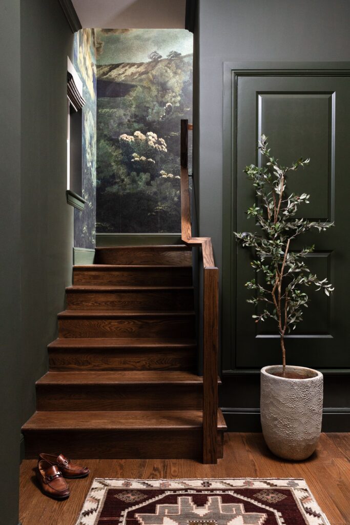
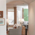
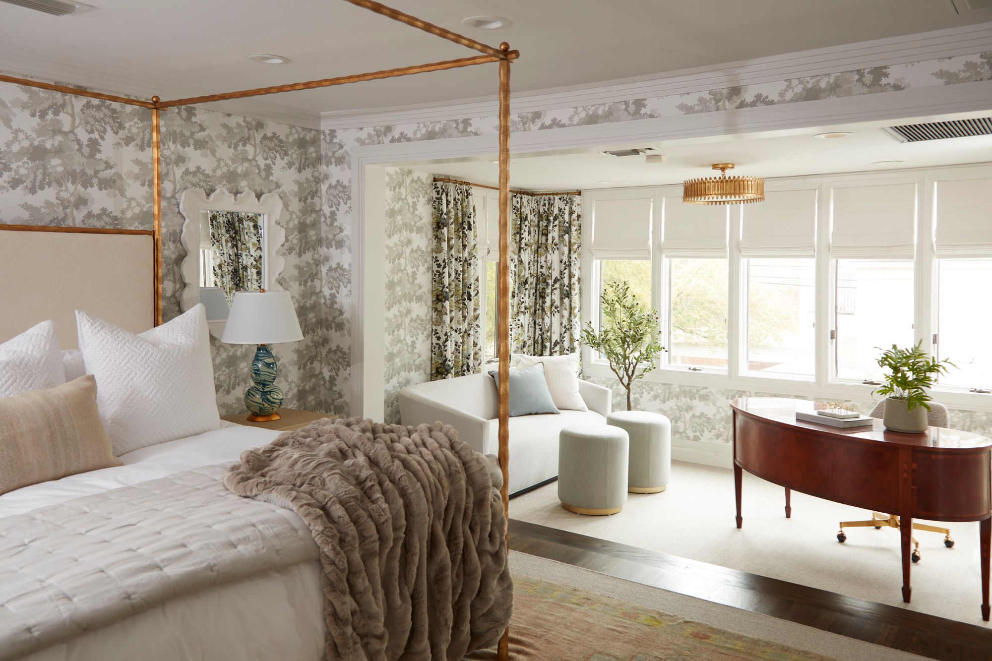
In Project Chestnut and Steel, we built the entire palette around that idea. Our client, a Dallas attorney who traveled constantly, needed his home to do real decompression work. We went with dark tones, deep texture, and a mural that traverses the staircase like a walk into the woods. Rich color does the heavy lifting throughout, and the effect is exactly what we were after. The moment you walk in, you exhale.
What Paint Colors Make a Room Feel Warm and Inviting?
A bright, airy room can feel calm because nothing is competing for your attention. But saturated color gets you there a different way, by making a room feel like it was put together with intention, over time, by someone who knew exactly what they loved.
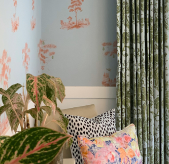
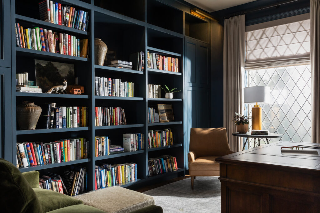
The study at Project Sage and Roses is a good example. Benjamin Moore Brush Blue on the walls and bookshelves gave the room an immersive quality that’s hard to achieve any other way. There’s a version of deep, saturated color that feels like too much. And there’s a version that makes you want to pull up a chair and stay. That’s always the goal.
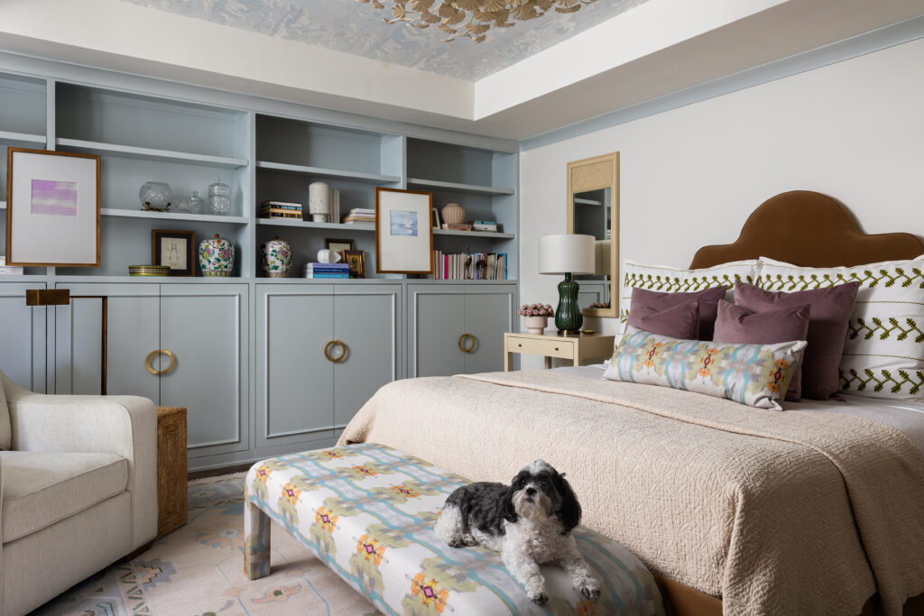
The Best Neutral Paint Colors for a Calming Room
Not every calming paint color is deep or dramatic. Dead Salmon by Farrow & Ball is one of those colors I keep coming back to for clients who want warmth without commitment. The name doesn’t do it any favors, but the color absolutely does.
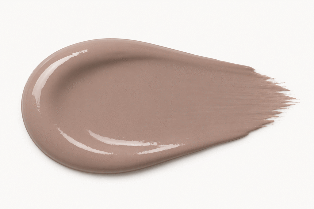
It’s technically a neutral. It won’t shock anyone. But it has a warmth to it that white simply can’t replicate. Depending on your light, it reads as mushroom, as blush, as something close to a faded terracotta. It shifts, but it never feels uncertain.
How to Choose Paint Colors for a Relaxing Space
The fear most people have about choosing paint colors for a relaxing room isn’t really about color. It’s about getting it wrong, committing to something bold and regretting it. That’s a legitimate concern, and it’s exactly why color decisions deserve more than a paint chip held up to a wall in the middle of the day.
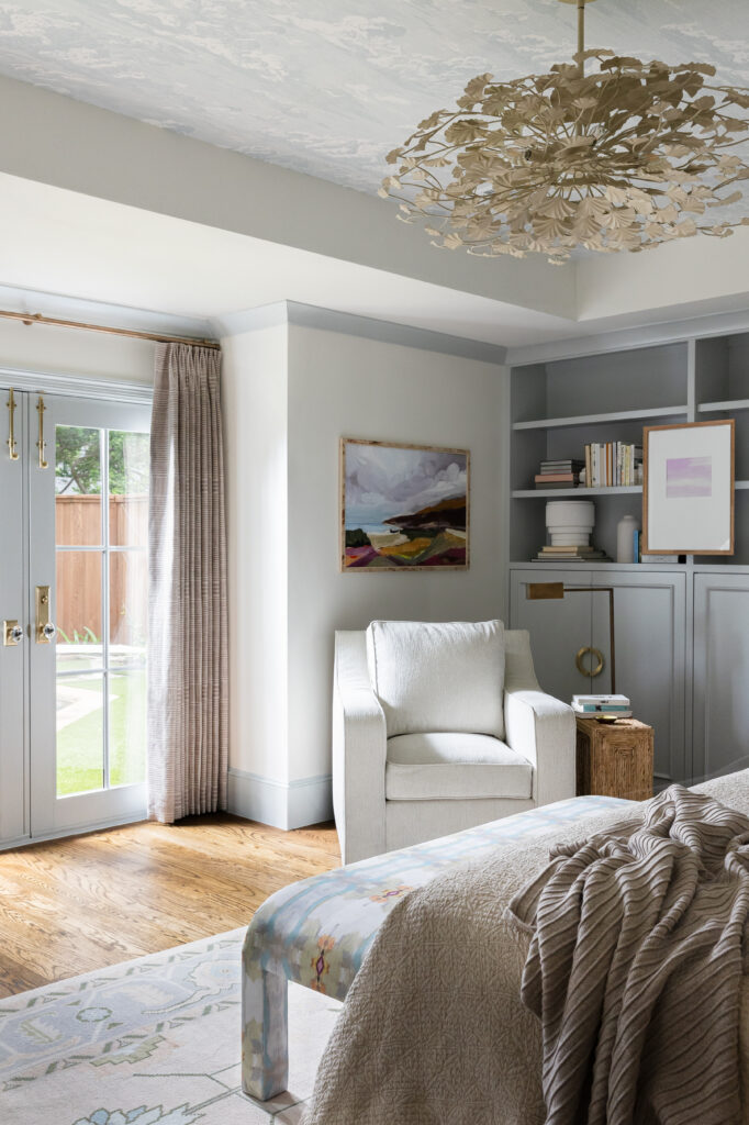
Color on the walls is a start. Color on the trim, molding, and ceiling is a commitment, and that’s exactly what makes a room feel complete.
When we approach color for a calming space, we’re thinking about how it reads in evening light, how it interacts with the furnishings, what it asks of the room and the person in it. Soft blues and warm creams can carry just as much quiet authority as white, often more, because they feel chosen rather than defaulted to.
White is a fine answer. But it’s not the only one. And for many of the Dallas home interiors we design, the rooms that feel most like a refuge are the ones where someone was willing to go a little deeper.Every home we design starts with a custom color palette built around how you live, what you love, and how the light moves through your space. If that sounds like something you’re ready for, reach out here and we’ll get started.